
Visual Elements That Enhance Your Digital Identity
Choosing a Clean and Accessible Layout
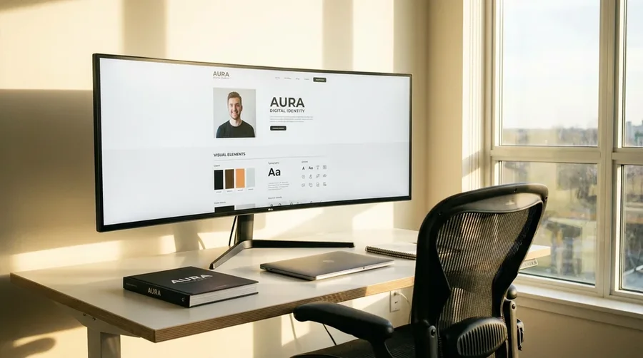
The visual foundation of your digital identity is the layout of your website or profile. A clean, organized layout does more than just look good; it communicates professionalism and respect for the visitor's time. Cluttered pages with competing elements, excessive text, and confusing navigation instantly deter users. When structuring your online presence, prioritize white space (or negative space). White space gives your content room to breathe and naturally guides the eye to the most important information. Ensure that your text is broken into digestible paragraphs, use clear headings, and keep your navigation menus simple and intuitive. Accessibility is also paramount. This means using readable font sizes, ensuring high contrast between text and background, and structuring the page so it works well on mobile devices. A clean layout ensures that your message is delivered without visual friction.
The Impact of High-Quality Profile Images
Your profile image is often the first visual element people notice, making it a critical component of your digital identity. A blurry, poorly lit, or inappropriately casual photo immediately undermines the professional narrative you have built in your text. You do not need a high-end studio portrait, but you do need an image that is clear, well-lit, and reflects how you present yourself in a working environment. Ensure your face is clearly visible, usually taking up about sixty percent of the frame. Dress appropriately for your specific industry, and choose a neutral, uncluttered background that does not distract from you. Using the same high-quality image across all your professional profiles creates a consistent visual anchor, making you instantly recognizable and reinforcing a polished, intentional digital presence.
Selecting Typography That Reflects Your Style
Typography is a subtle but powerful tool for conveying the tone and personality of your digital identity. The fonts you choose send immediate subconscious signals to the reader. Serif fonts, with their small decorative lines, often feel traditional, authoritative, and reliable, making them suitable for academic or formal corporate profiles. Sans-serif fonts, which have clean, straight lines, feel modern, approachable, and straightforward, making them a popular choice for tech, design, and freelance portfolios. Whatever style you choose, limit yourself to no more than two complementary fonts—perhaps one for your headings and another for your body text. The most critical factor is legibility. If a font is difficult to read, no matter how stylish it looks, it will hurt your communication. Thoughtful typography enhances your message without drawing undue attention to itself.
Using Color Schemes to Convey Mood
Color profoundly affects how people perceive a digital space. The color scheme you choose for your website or portfolio sets an immediate mood and should align with your professional brand. Blues often convey trust, stability, and calm, making them a staple in corporate and financial sectors. Greens suggest growth, balance, and creativity. Warmer colors like subtle oranges or soft reds can add energy and approachability, but should be used sparingly as accents so they do not overwhelm the viewer. The best approach is to choose a neutral base color (like white, soft gray, or off-white) for readability, accompanied by one primary accent color and perhaps one secondary complementary color. A restrained, intentional color scheme looks sophisticated and ensures that your actual work and content remain the focal point of the page.
Keeping Your Design Distraction-Free
In web design, less is almost always more. When building your digital identity, there is a strong temptation to include flashy animations, complex interactive elements, or background videos to make the site feel "modern." However, these elements often act as heavy distractions, pulling focus away from your actual skills and content. A distraction-free design prioritizes the user's ability to quickly find what they are looking for. Remove any element that does not directly support your core message or improve usability. If an animation does not serve a functional purpose, such as indicating a successful click, take it out. By stripping away unnecessary visual noise, you create a calm, focused environment where visitors can concentrate entirely on the quality of your work and the clarity of your professional story.